Assignments & Lesson Plans
Throughout my teaching journey, I have been exposed to the various rubrics and practices concerning the crafting of an assignment sheet that succeeds in communicating to students an assignment’s learning objectives and what it is they are expected to do. After each assignment, each semester, and each year, I learned new approaches to making an assignment sheet more manageable and more accessible for a student, particularly concerning the use of spacing. However, it was after I worked with my former mentor Dr. Erica Stone and used her approaches to design to apply to my own assignment sheets that I began to see how even minor design revisions had a significant impact.
Assignment Sheets
For Fall 2022, I taught this assignment for the first time, and I used a similar format to what Dr. Stone had used for her assignment sheets. However, I did not use headings in this assignment sheet, which did not create a Table of Contents for students to go to particular sections more easily.
Lesson Plans
Ever since learning about the principles and elements of document design, I have worked on being more intentional not just with the design of my syllabus, schedule, and assignment sheets, but with my lessons plans, or presentations, as well.
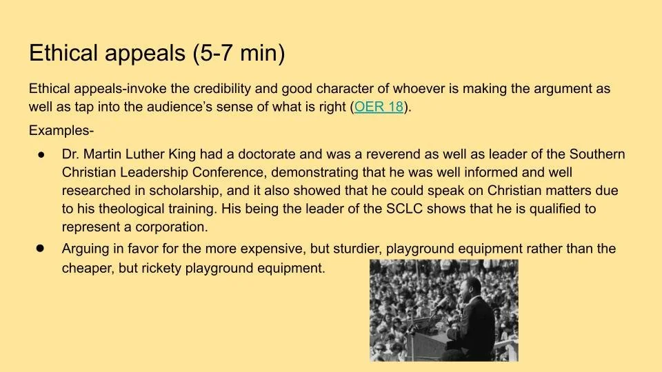
Here, I have my lesson plan for teaching rhetorical analysis for Fall 2022. Although I was newly aware of the principles and elements of document design, I had not put them into practice as rigorously as I would have liked. I took accessibility into consideration by using a soft background color for screenreaders, but I still had too much text on my slides, and I did not have good balance with regard to image and text.
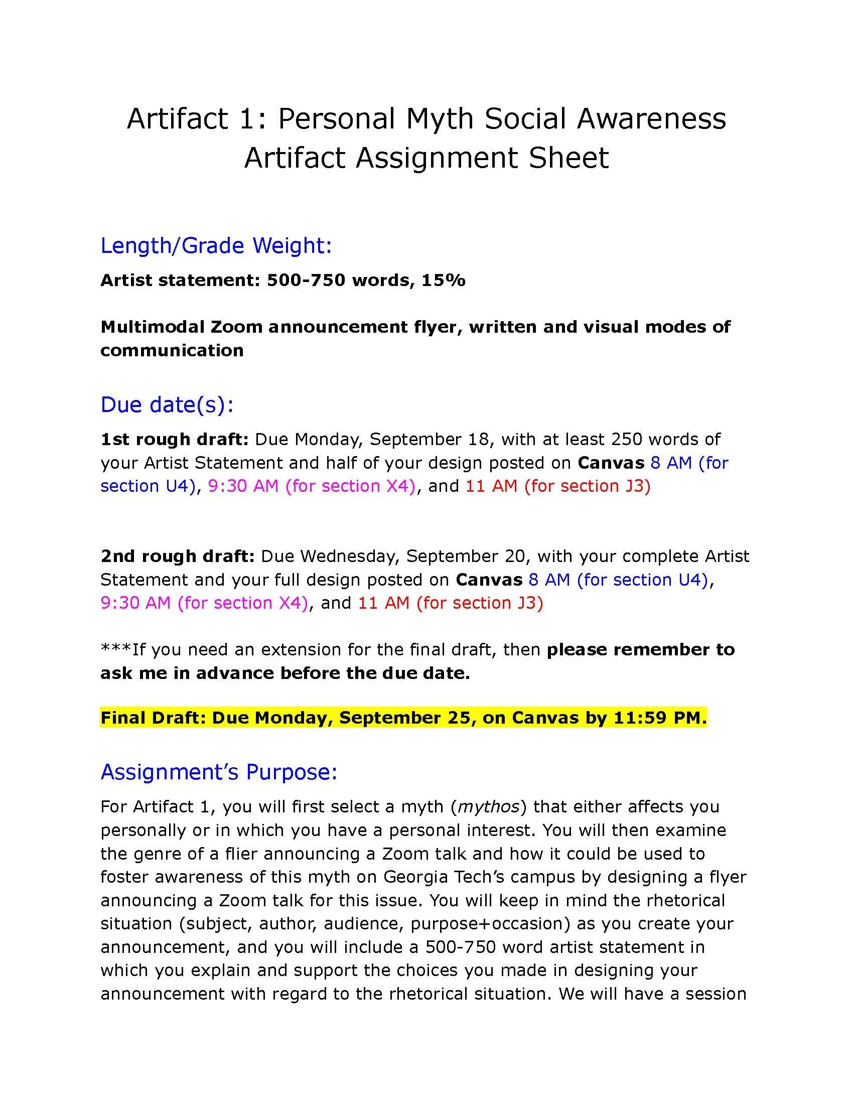
For Fall 2023, I revised the assignment sheet for this assignment by using headings to distinguish different sections of the assignment sheet so that students might find them more easily. Additionally, I used color coding for each different course section so that I could use the same assignment sheet while distinguishing due dates for different course sections.

This lesson plan for Fall 2023 is for the same lesson. However, I was more intentional with considering the amount of text I put on a slide, breaking up content with bullet points, and using white space. Additionally, I thought of principles of document design such as balance and proportion in order for the overall appearance to be more organized. Finally, I added alt text to images in order that any images used met accessibility standards.